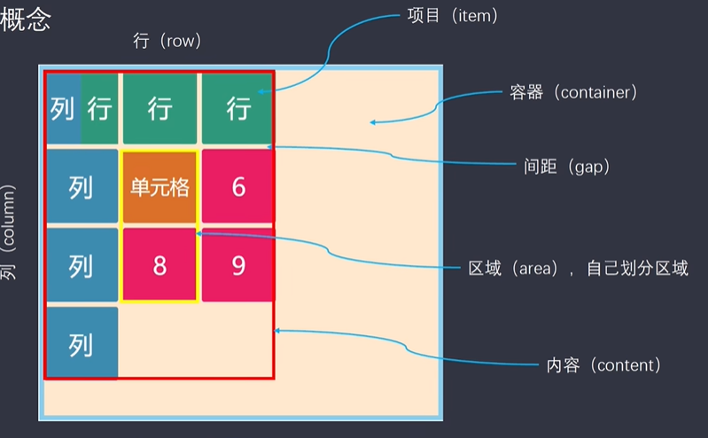
grid-template-columns属性:
指定网格内子元素的列宽,及追踪变化的函数
函数:
repeat()
第一个参数可以是数字,指重复的次数。auto-fill自动填充父元素空间
第二个参数是具体的尺寸值
minmax()
第一个参数,最小值
第二个参数,最大值
1grid-template-columns: [line-name]] 100px;
[line-name]是指网格线
100px固定值,指定列的宽度,可以指定多个列的宽度(多个值)
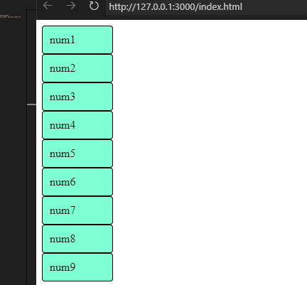
1grid-template-columns: 1fr 100px 1fr;
fr单位,是父元素的宽度的均分(xfr xfr =(x + x = 父元素宽度))
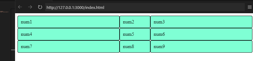
grid-template-rows属性
指定网格子元素的行高,追踪变化函数
1.container {
2  width: 100%;
3  display: grid;
4  grid-template-columns: 100px auto;
5  grid-template-rows: 100px auto;
6}
grid-template
把区域默认分为9格
| 列 1 | 列 2 | 列 3 |
|---|---|---|
| a1 | a2 | a3 |
| b1 | b2 | b3 |
| c1 | c2 | c3 |
1.template {
2    display: grid;
3    grid-template: 'a a a3' 100px 'b b b3' 200px 'c1 c2 c3' 100px;
4}
5.a {
6    grid-area: a;
7}
把a类名元素通过grid-area(区域)指定为grid-template中“a”的占位元素
1<div class='template'>
2  <div class='item a'>item1</div>
3  <div class='item'>item2</div>
4  ...
5  <div class='item'>item9</div>
6</div>
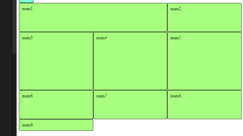
grid-area属性
将某些网格定义为一个区域
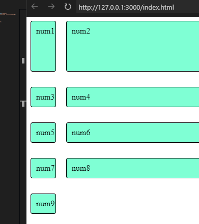
gap属性
gap: 行间距 列间距
单独设置间距: column-gap,row-gap
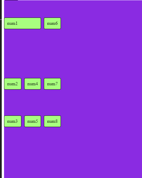
grid-auto-flow
自动排序方式(横排,竖排)
1  .template {
2    width: 100%;
3    height: 800px;
4    display: grid;
5    grid-template: 'a a a3' 100px 'b b b3' 200px 'c1 c2 c3' 120px/60px (行高/列宽);
6    background-color: blueviolet;
7    gap: 10px;
8    align-items: end;  //item内容竖轴对齐方式
9    justify-content: start; //item相对容器横轴对齐方式
10    grid-auto-flow: column; //从上往下竖排
11  }
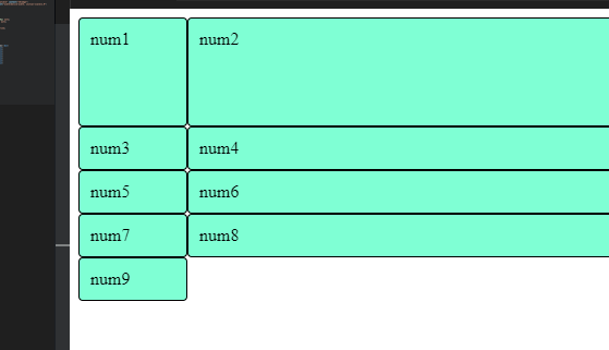
grid-auto-rows/columns
未被定义的多余的项目的行/列属性
1.container {
2  width: 100%;
3  display: grid;
4  grid-template-columns: [line] 50px auto;
5  grid-template-rows: 100px auto 50px;
6  gap: 10px 20px;
7  grid-auto-rows: 200px;
8  row-gap: 20px;
9}
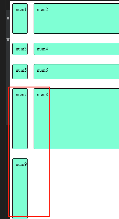
前面3行被定义了,后面多余的2行未被定义就是grid-auto-rows多余的项